Mustang Media Group
ABOUT
Mustang Media Group is Cal Poly San Luis Obispo's award-winning student-run media organization. It's comprised of Mustang News, KCPR 91.3 FM, and Mustang Media Group Advertising & Business.
I currently work as an Advertising Design Manager for MMG's Advertising & Business team. I previously worked on the team as an Advertising Designer for a year prior to being promoted.
MY ROLE
I lead a team of four designers to oversee creative direction and project timelines of our special edition magazines. I work alongside account executives and businesses across San Luis Obispo to develop print and digital advertisements. I also help design special edition magazines, promotional materials, and marketing campaigns.
Below is some of the work I've done under MMG so far.
CLIENTS
Mustang Media Group, Local Businesses in San Luis Obispo
SCOPE
Print & Digital Advertising Design, Editorial & Layout, Marketing
PROGRAMS
Adobe Illustrator, Adobe InDesign, Adobe Photoshop, Figma, Coda, Trello
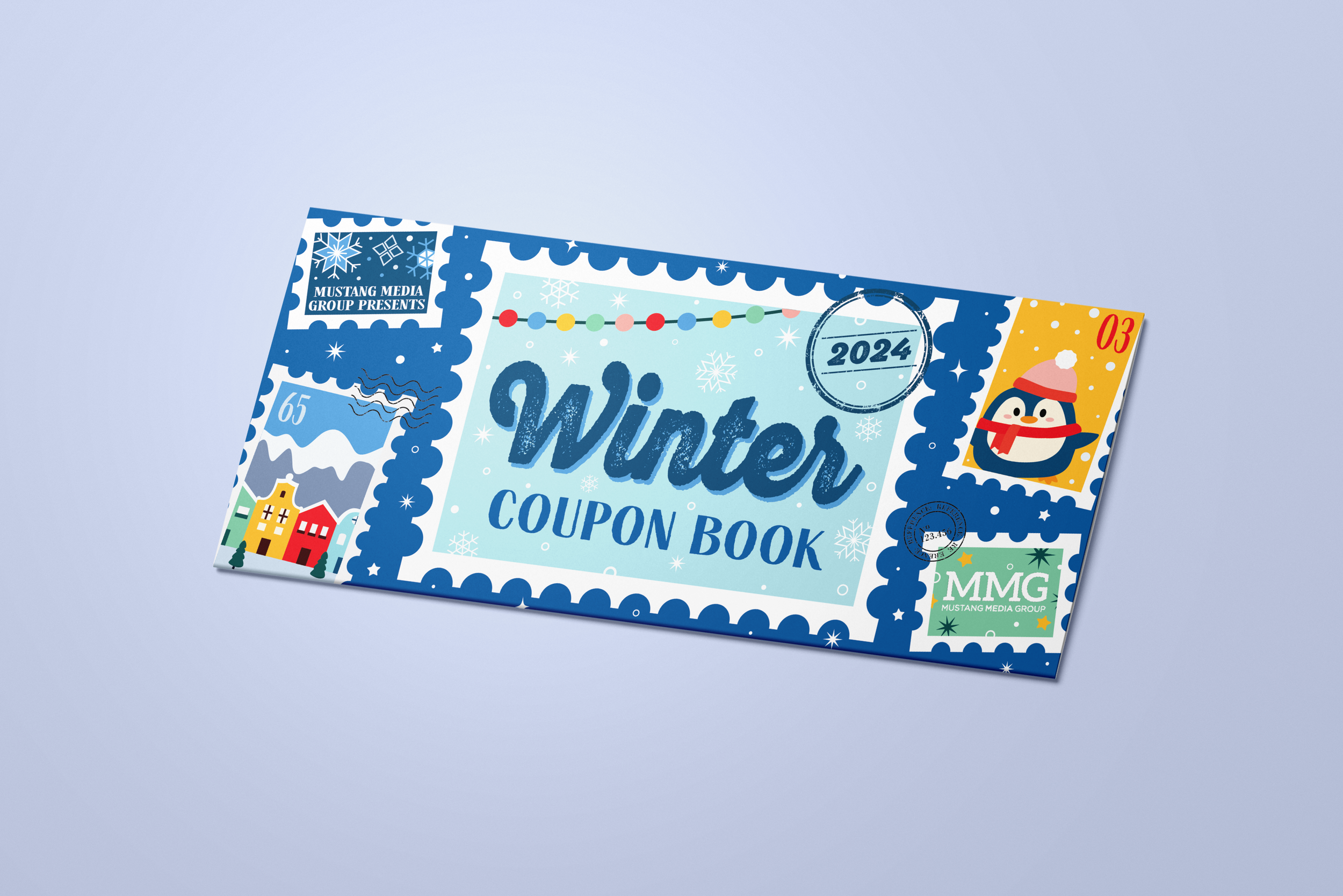
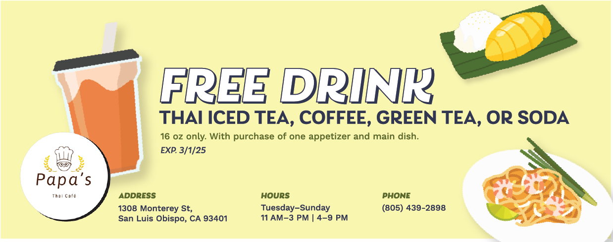
Winter Coupon Book
IN THIS PROJECT I WAS TASKED TO
Collaborate with a co-designer to create an eye-catching, festive winter-themed coupon book featuring dozens of advertisements from local San Luis Obispo business.
ROLE:
Advertising & Cover Designer
TIMELINE:
4 Weeks
SPECIAL EDITION MAGAZINES
Moodboard & Ideation
Two concepts I had for this cover were either stamps or a ticket/vintage coupon, which I created initial drafts for each. The color palette I chose was for visualization purposes of my sketches, but some of the colors eventually became part of my final color palette.


Moving forward, I decided to solely focus on the stamp idea. For the second draft, I worked on simplifying the illustrations and getting a concrete color palette. I wanted a color palette that wasn't too holiday themed, but also bright enough to look good when printed. I also played around with the typography in these drafts, I wanted to find something interesting that gave that stamp-feel.
Second Draft

For this draft, I focused on incorporating some of the elements from my co-designer's drafts. His stamps were spaced out and more sporadically placed with these rustic stamp markings that he created to to fill in blank space, so I emulated that idea. I also changed the background color from dark green to bright blue so that the stamps will truly pop once printed.

Third Draft
Final Design
Click here to check out the full PDF on Issuu.com!


2024 Housing Fair
Design various marketing collateral to advertise MMG’s annual Housing Fair, highlighting on-campus housing resources and off-campus housing vendors.
Moodboard & Ideation
IN THIS PROJECT I WAS TASKED TO
ROLE:
Advertising Design Manager
TIMELINE:
3 Weeks
I worked closely alongside MMG’s Marketing & PR Manager on this project. We met to talk about her vision for this housing fair and how she wanted the marketing campaign to align with it. The theme for this year was “Housing 101”, so she wanted something with school-vibes.
I created a moodboard on Pinterest and found some pieces that used scrapbook letters for title text that I really liked. I also saw some work that were very doodley and utilized paper textures that I also thought would work well. I was a bit short on time to jump into Illustrator and do a full first draft, so I utilized Canva and their pre-existing design assets to mock-up my idea and present it to our marketing manager for feedback.


MARKETING CAMPAIGNS
Drafts
Final Design
Our marketing manager really liked the vision I had in the mockup, so I went straight into Illustrator to work on some drafts. I individually created each scrapbook letter for the title, and made sure to diversify the colors and typography to really give it the mismatched feel.
Upon feedback for the first draft, I had to resize my graphic as upon consulting with our social media manager we found that 4:5 aspect ratio sized images perform better than the traditional 1080 x 1080 px. I also received more updated copy for the call to action, and moved it to the top so it would be larger and more prominent. Lastly, I added some doodles to fill up white space and make it feel more like a notebook.


My manager provided the finalized copy for the graphic and gave me some feedback on highlight the tagline more as well as emphasizing the “free pizza”. I added the tagline onto colored washi tape at the top so it stood out. I designed a pizza sticker to add on the graphic and changed the pen stroke of the doodles to be more sketchy.

Additional Graphics
Using my main graphic as a theme, I created two more additional posts to market the fair. Each one had a different emphasis, one post was intended to highlight the free pizza that was being given away as a way draw in more students and another post showcasing all of the resources and venues that were going to be at the fair.


Stamp Cards
Lastly, I created a stamp card that was utilized on the day of the fair in order to get attendees engaged with the vendors.


2024 Housing Fair
Design various marketing collateral to advertise MMG’s annual Housing Fair, highlighting on-campus housing resources and off-campus housing vendors.
Moodboard & Ideation
IN THIS PROJECT I WAS TASKED TO
ROLE:
Advertising Design Manager
TIMELINE:
3 Weeks
I worked closely alongside MMG’s Marketing & PR Manager on this project. We met to talk about her vision for this housing fair and how she wanted the marketing campaign to align with it. The theme for this year was “Housing 101”, so she wanted something with school-vibes.
I created a moodboard on Pinterest and found some pieces that used scrapbook letters for title text that I really liked. I also saw some work that were very doodley and utilized paper textures that I also thought would work well. I was a bit short on time to jump into Illustrator and do a full first draft, so I utilized Canva and their pre-existing design assets to mock-up my idea and present it to our marketing manager for feedback.
MARKETING CAMPAIGNS
Drafts
Final Design
Our marketing manager really liked the vision I had in the mockup, so I went straight into Illustrator to work on some drafts. I individually created each scrapbook letter for the title, and made sure to diversify the colors and typography to really give it the mismatched feel.
Upon feedback for the first draft, I had to resize my graphic as upon consulting with our social media manager we found that 4:5 aspect ratio sized images perform better than the traditional 1080 x 1080 px. I also received more updated copy for the call to action, and moved it to the top so it would be larger and more prominent. Lastly, I added some doodles to fill up white space and make it feel more like a notebook.
My manager provided the finalized copy for the graphic and gave me some feedback on highlight the tagline more as well as emphasizing the “free pizza”. I added the tagline onto colored washi tape at the top so it stood out. I designed a pizza sticker to add on the graphic and changed the pen stroke of the doodles to be more sketchy.
Additional Graphics
Using my main graphic as a theme, I created two more additional posts to market the fair. Each one had a different emphasis, one post was intended to highlight the free pizza that was being given away as a way draw in more students and another post showcasing all of the resources and venues that were going to be at the fair.
Stamp Cards
Lastly, I created a stamp card that was utilized on the day of the fair in order to get attendees engaged with the vendors.
OTHER MARKETING COLLATERAL


PRINT & DIGITAL ADVERTISEMENTS