Nexstera Tech
Iter8 is Cal Poly’s student-run UX/UI design agency. They predominantly partner with startups to do freelance work for them.
This project was for Nexstera Tech, which is a tech startup that focuses on environmental initiatives. Their flagship product is Pyrotack, which is a device that attaches onto garbage trucks to detect lithium batteries before they get tossed into landfills.
MY ROLE
During my junior winter and spring quarters, I worked on two different projects as a designer. I worked on Nexstera during the winter along with 7 other designers under the guidance of a project manager.
CLIENT
Nexstera Tech
SCOPE
UX/UI Design
PROGRAMS
Figma

GLAZED Cupcakes
Redesign a modern, sleek website that equally caters to potential investors and educating the average internet user.
Competitor Analysis
Sketches
Prototyping

Design System
We then started brainstorming ideas for our design system. Nexstera’s founder, Penny, said she really wanted to implement shades of green, so we kept that in mind. She also wanted something modern and sleek, so we looked at mostly sans-serif fonts. This is our finalized design system after a lot of mood boarding.


Final Design
IN THIS PROJECT I WAS TASKED TO
ROLE:
UX/UI Designer
TIMELINE:
January 2024–March 2024
We decided to start out by looking at Nexstera’s current website and comparing it to other sites. We did a competitor analysis on similar tech companies and came up with a list of opportunities that we could implement in the redesign.


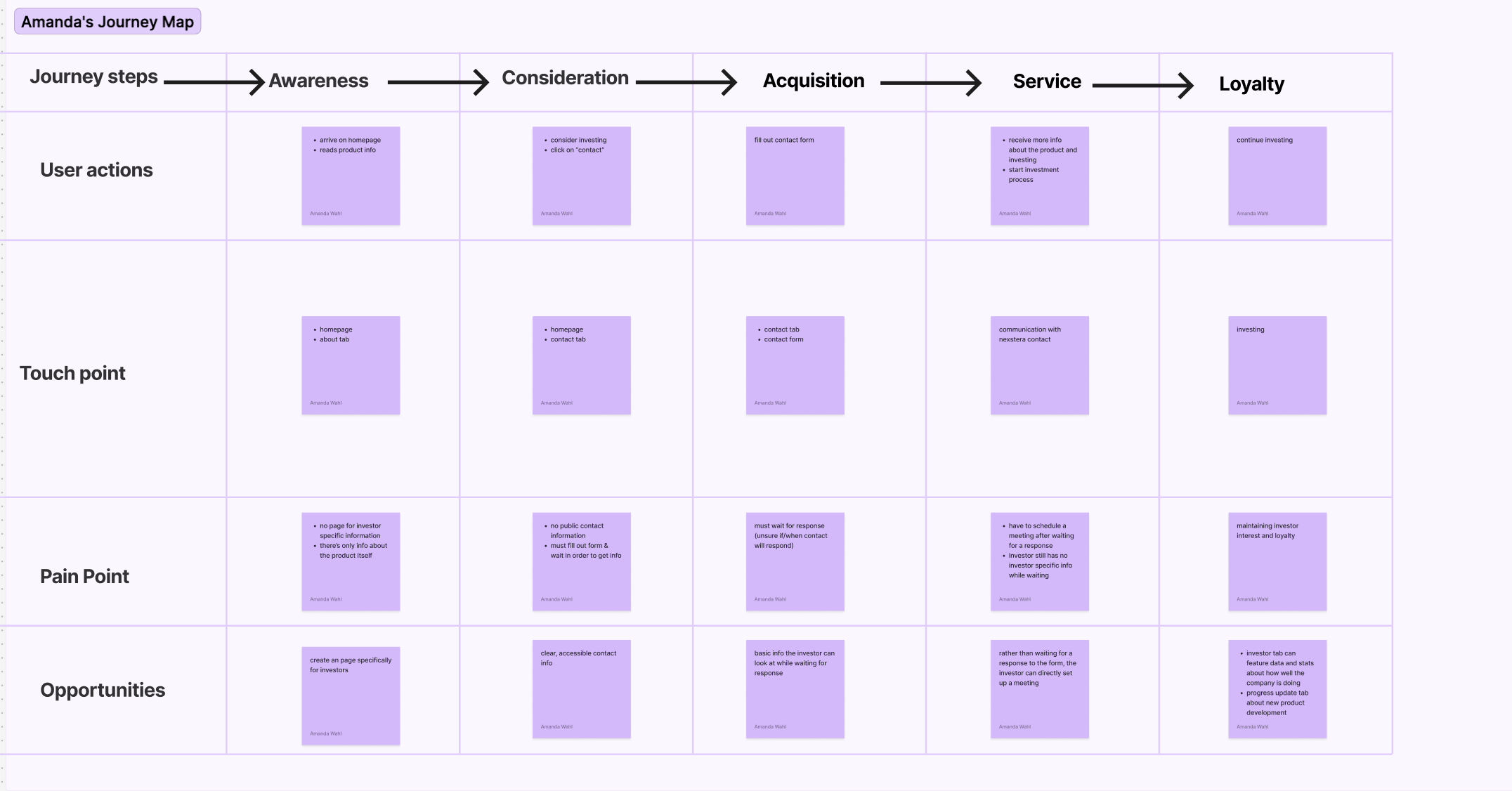
Journey Map
We then decided to analyze Nexstera’s current website and create individual journey maps based on that. We used this to evaluate the most important aspects of the website, and some current paint points that could be improved on.
Using Procreate on my iPad, I came up with some rough ideas for potential screens and flows for the investor page. We had all split up to create different sketches for different pages, and then came together to share our sketches and chose the aspects we liked from each one to implement in our prototype.


We then began prototyping in Figma. We had a few different variations of some of the pages, so we conducted A/B testing and think aloud studies in order to determine which variations or aspects users liked the best.

Read our in-depth case study and take a look at our final prototype here.